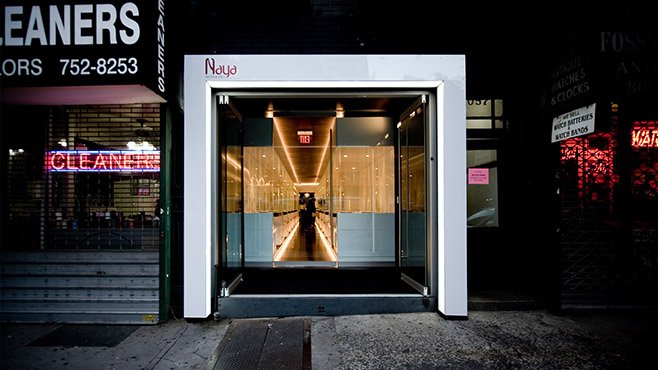
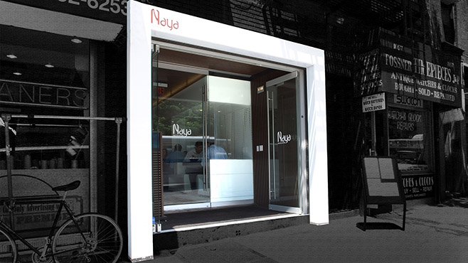
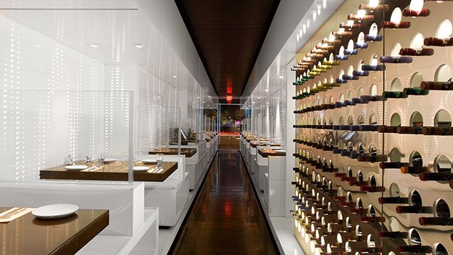
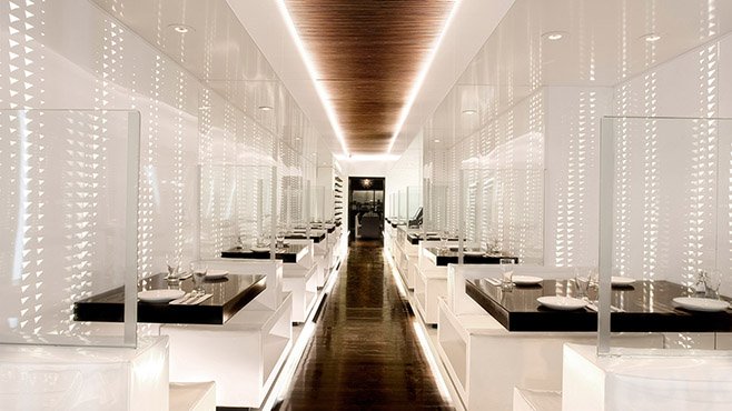
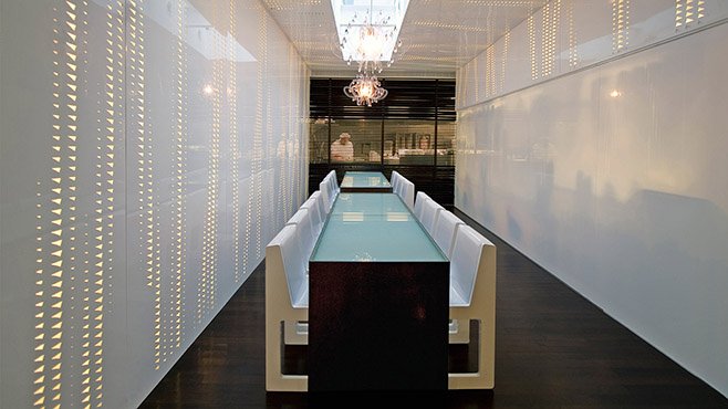
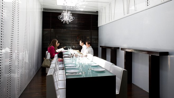
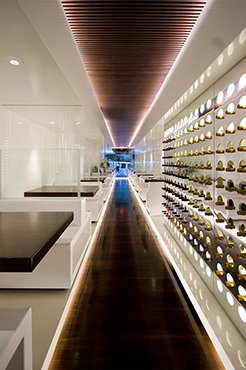

At just 3 meters wide and 35 meters in length, the venue was the worst possible space for a restaurant. Crooked walls and a complete lack of windows added further constraints. After much deliberation, SOMA employed a simple solution to overcome the tremendous site constraints: SOMA decided to reinforce those constraints, and flip them to their advantage. The solution was to create an even longer and narrower space than was already in place. The result was like an illusion.
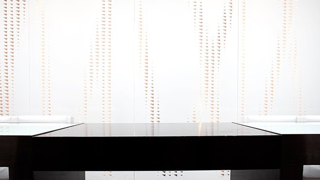
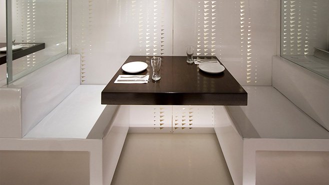
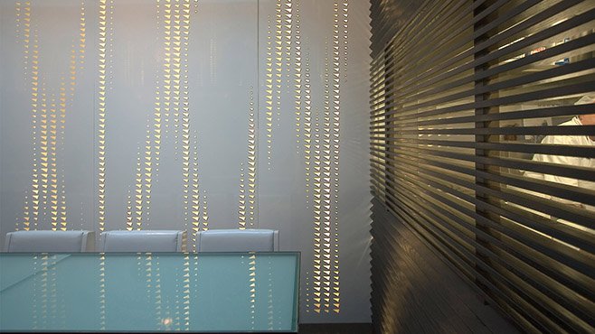
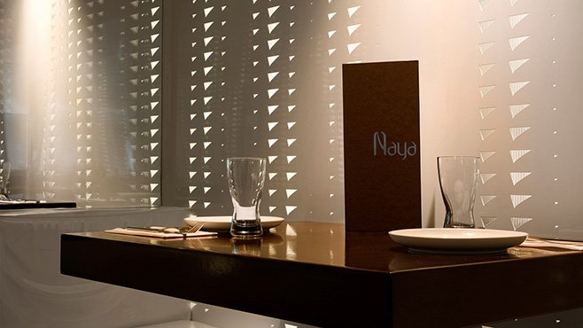
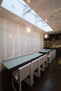
It appeared to lengthen the space beyond the perimeters of the original structure. Dining seats and tables were then carved along the crooked walls on both sides of the restaurant, yet remained perfectly aligned along the single, central corridor. The walls were given a double skin, with the outer layer being powder-coated white aluminum. Led strip-lights were set between the walls, and the outer wall was perforated using a parametric computer-generated design of variable density of motifs from the cuneiform alphabet.
